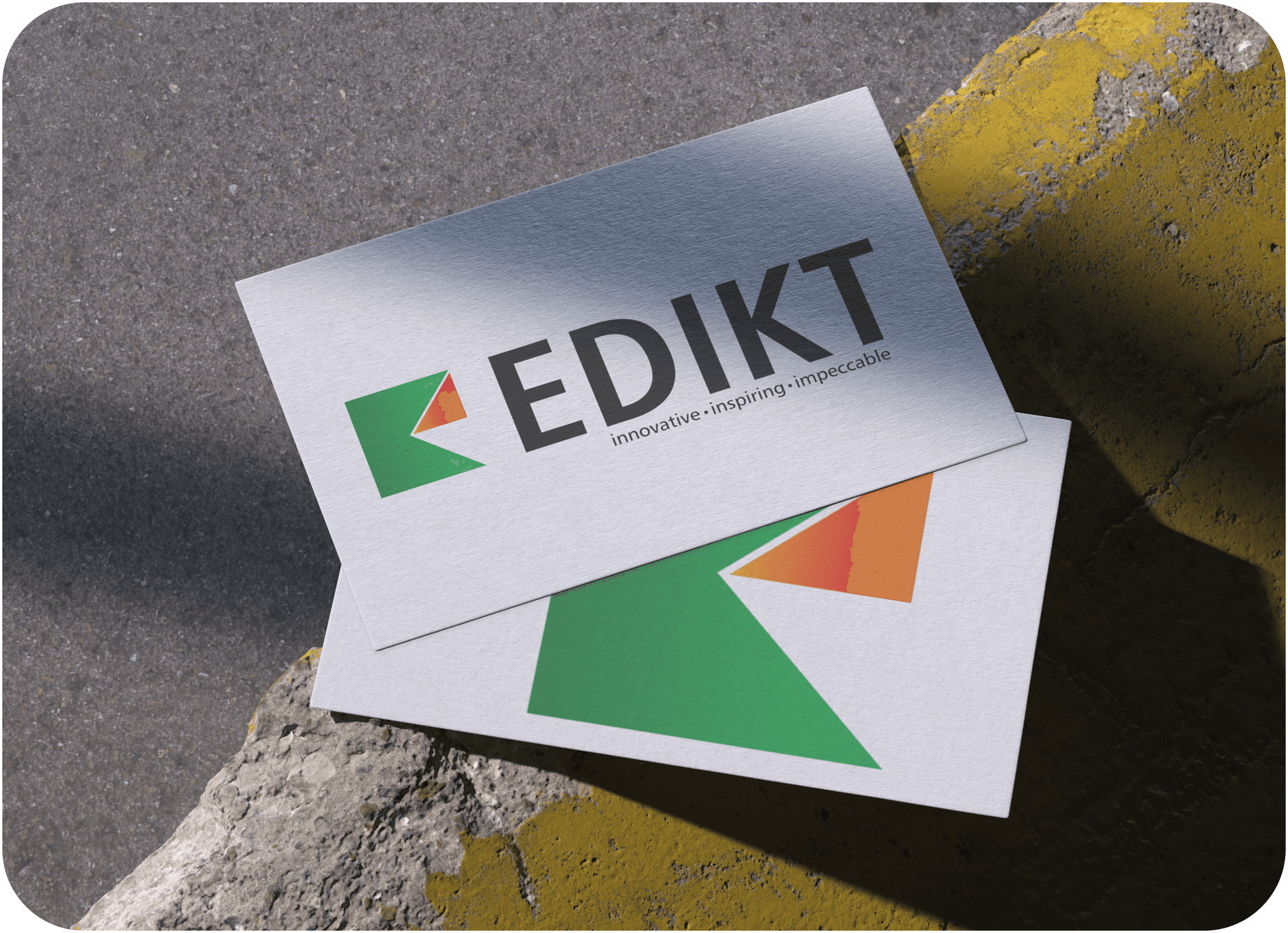
Edikt Media Logo
The Edikt Media logo reflects our bold vision — where innovation meets clarity. A mark that moves forward, just like us.

Overview
The Edikt Media logo was designed with the intention of reflecting the agency's bold and modern identity. Our goal was to create a mark that communicates creativity, professionalism, and forward-thinking. The clean, geometric shape symbolizes structure and reliability, while the sharp cut resembling an arrow represents progress, movement, and leadership — showcasing Edikt Media as a dynamic and innovative brand. The design strikes a balance between creative energy and a strong, trustworthy foundation.
Logo AIM
Showcase Forward Thinking & Innovation
The arrow-inspired cut within the shape signifies movement, vision, and leadership, positioning Edikt Media as a progressive, forward-moving brand.
Balance Between Creativity and Structure
The clean, geometric base adds a sense of professionalism and reliability, while the cut and vibrant colors bring in the creative flair, striking a balance between discipline and imagination.
Use Color to Communicate Emotion & Energy
Green symbolizes growth, freshness, and trust — key traits of a dependable creative partner.
Red to orange conveys passion, boldness, and enthusiasm, representing the vibrant energy Edikt Media brings to every project.
Keep the Logo Versatile & Modern
The minimal, sharp form ensures the logo looks great across digital platforms, print media, and merchandise.
The scalable and modular look was intentional to ensure adaptability.
Reinforce Brand Identity with Tagline
We aligned the visual with the tagline:
“Innovative • Inspiring • Impeccable”
This further builds clarity around Edikt Media’s personality and promise.
Neue Frutiger Pro
Condensed Bold
Bold, Sans-serif Typeface
No decorative elements,
focus on professionalism and direct communication
Green
Gradient
Red to Orange
Gradient
Behind the Logo: Font & Gradient Story
The Edikt Media logo is designed to reflect both creative boldness and professional clarity. The typeface Neue Frutiger Pro Condensed Bold was chosen for its strong, clean, and modern appearance — perfectly aligning with the brand’s dynamic presence in the digital and media space. Its condensed style gives the logo a compact, contemporary feel, while the bold weight adds authority and confidence. The color palette combines two distinct gradients: a green gradient symbolizing growth, innovation, and fresh ideas, and a red-to-orange gradient representing energy, passion, and forward momentum. Together, these gradients create a vibrant and engaging visual identity that captures the essence of Edikt Media — a team that is serious about delivering impactful, cutting-edge design solutions.

Let’s get to the work
We’re here to make it happen. Let’s create something extraordinary together — just
hit the button below and start your journey with Edikt Media.

Office no 513, Fortune Business Centre,
Kaspate Wasti, Near Chatrapati chowk, Wakad, Pune-411057
Our Presence :
India | Europe | UAE | Russia | China | USA | Malaysia | Africa | Istanbul
Head Office : Pune
Warehouse : Pune | Mumbai | Delhi | Bengaluru | Hyderabad | Chennai
contactus@edikt.in
+91 86683 69434

Overview
Partnering with SSSS for their high-profile event proved to be a major milestone in terms of execution and impact. From initial planning to the final wrap-up, our team delivered exceptional results, ensuring that every element — from stage design to crowd management — ran smoothly and professionally.
Logo AIM
The arrow-inspired cut within the shape signifies movement, vision, and leadership, positioning Edikt Media as a progressive, forward-moving brand.
Showcase Forward Thinking & Innovation
The clean, geometric base adds a sense of professionalism and reliability, while the cut and vibrant colors bring in the creative flair, striking a balance between discipline and imagination.
Balance Between Creativity and Structure
Green symbolizes growth, freshness, and trust — key traits of a dependable creative partner. Red to orange conveys passion, boldness, and enthusiasm, representing the vibrant energy Edikt Media brings to every project.
Use Color to Communicate Emotion & Energy
The minimal, sharp form ensures the logo looks great across digital platforms, print media, and merchandise. The scalable and modular look was intentional to ensure adaptability.
Keep the Logo Versatile & Modern
We aligned the visual with the tagline:
“Innovative • Inspiring • Impeccable”
This further builds clarity around Edikt Media’s personality and promise.
Reinforce Brand Identity with Tagline
Neue Frutiger Pro
Condensed Bold
Bold, Sans-serif Typeface
No decorative elements,
focus on professionalism and
direct communication
Green
Gradient
Red to Orange
Gradient
Behind the Logo:
Font & Gradient Story
The Edikt Media logo is designed to reflect both creative boldness and professional clarity. The typeface Neue Frutiger Pro Condensed Bold was chosen for its strong, clean, and modern appearance — perfectly aligning with the brand’s dynamic presence in the digital and media space. Its condensed style gives the logo a compact, contemporary feel, while the bold weight adds authority and confidence.
The color palette combines two distinct gradients: a green gradient symbolizing growth, innovation, and fresh ideas, and a red-to-orange gradient representing energy, passion, and forward momentum. Together, these gradients create a vibrant and engaging visual identity that captures the essence of Edikt Media — a team that is serious about delivering impactful, cutting-edge design solutions.
Lights, Sound & Lens – Crafting an Immersive Experience
At the SSSS event, we delivered a complete 360-degree experience that reflected top-tier quality in every detail. From vibrant lighting that enhanced the visual appeal, to crisp, immersive sound that filled the entire space — every element was thoughtfully executed. Our team made sure the stage setup, ambiance, and technical support aligned perfectly to create an unforgettable experience.
We believe that perfection lies in the details, and that’s exactly what we focused on — clean installation, premium-grade equipment, professional photography, and seamless coordination. The entire event was a reflection of our promise to deliver not just an event, but an experience that speaks of quality and precision from every angle.