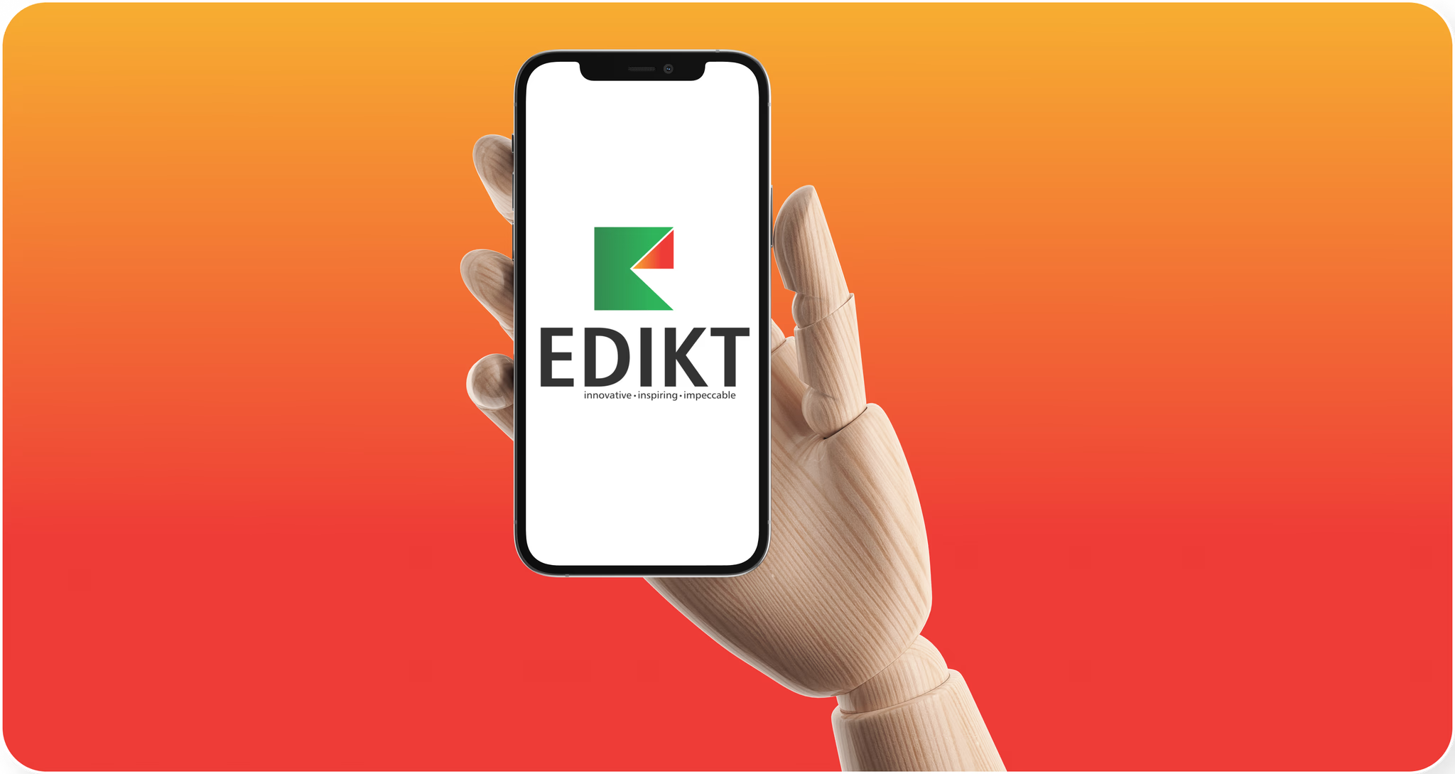
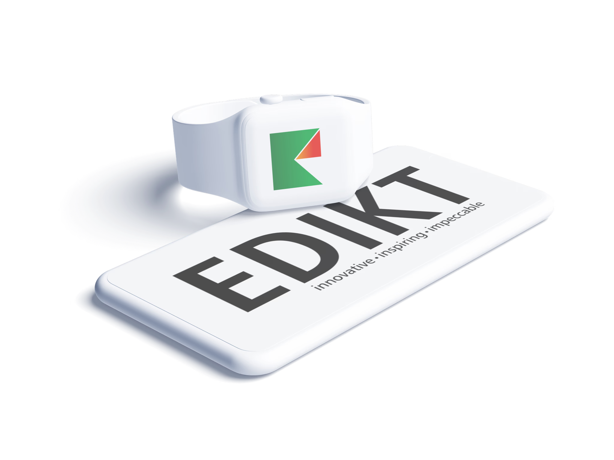
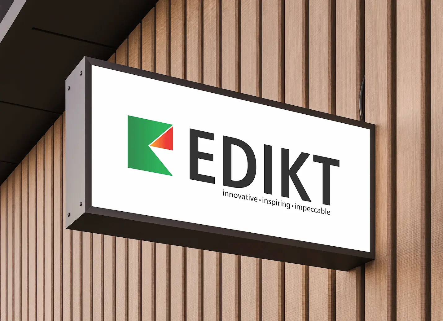
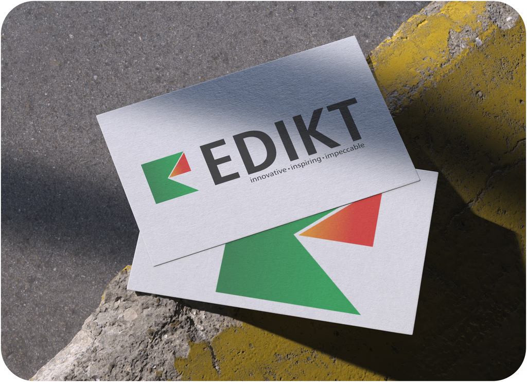
Edikt Media Logo
The Edikt Media logo reflects our bold vision — where innovation meets clarity. A mark that moves forward, just like us.
Overview
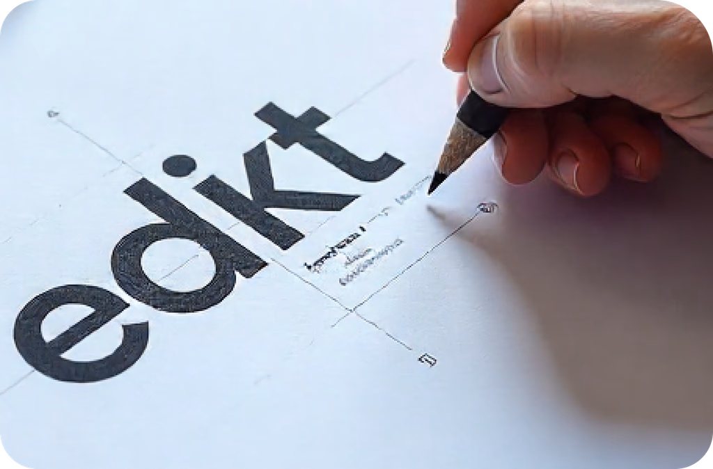
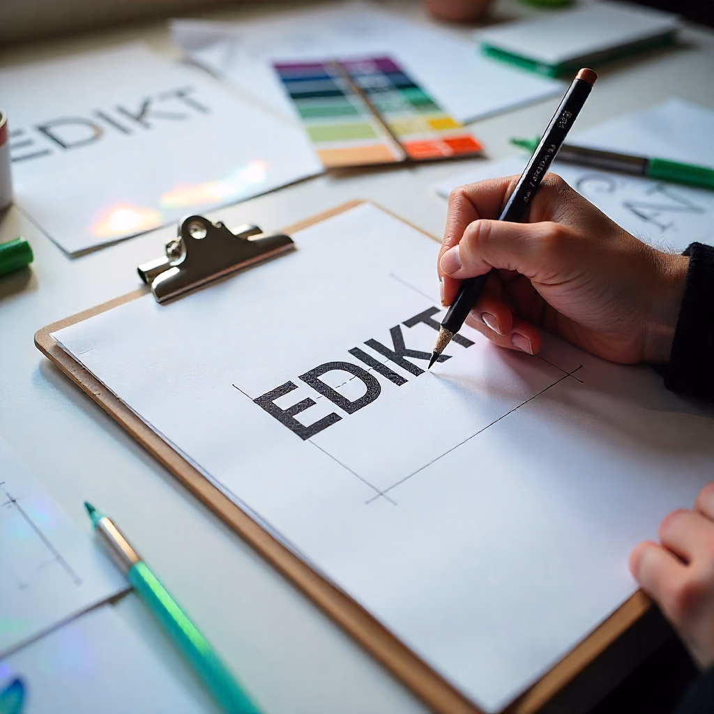
The Edikt Media logo was designed with the intention of reflecting the agency's bold and modern identity. Our goal was to create a mark that communicates creativity, professionalism, and forward-thinking. The clean, geometric shape symbolizes structure and reliability, while the sharp cut resembling an arrow represents progress, movement, and leadership — showcasing Edikt Media as a dynamic and innovative brand. The design strikes a balance between creative energy and a strong, trustworthy foundation.
Logo AIM
Showcase Forward Thinking & Innovation
The arrow-inspired cut within the shape signifies movement, vision, and leadership, positioning Edikt Media as a progressive, forward-moving brand.
Balance Between Creativity and Structure
The clean, geometric base adds a sense of professionalism and reliability, while the cut and vibrant colors bring in the creative flair, striking a balance between discipline and imagination.
Use Color to Communicate Emotion & Energy
Green symbolizes growth, freshness, and trust — key traits of a dependable creative partner. Red to orange conveys passion, boldness, and enthusiasm, representing the vibrant energy Edikt Media brings to every project.
Keep the Logo Versatile & Modern
“The minimal, sharp form ensures the logo looks great across digital platforms, print media, and merchandise. The scalable and modular look was intentional to ensure adaptability.”
Reinforce Brand Identity with Tagline
We aligned the visual with the tagline:
“Innovative • Inspiring • Impeccable”
This further builds clarity around Edikt Media’s personality and promise.

NEUE FRUTIGER PRO
CONDENSED BOLD
BOLD, SANS-SERIF TYPEFACE
No decorative elements, focus on professionalism and direct communication
Gradient
Gradient

Behind the Logo: Font & Gradient Story
The Edikt Media logo is designed to reflect both creative boldness and professional clarity. The typeface Neue Frutiger Pro Condensed Bold was chosen for its strong, clean, and modern appearance — perfectly aligning with the brand’s dynamic presence in the digital and media space. Its condensed style gives the logo a compact, contemporary feel, while the bold weight adds authority and confidence. The color palette combines two distinct gradients: a green gradient symbolizing growth, innovation, and fresh ideas, and a red-to-orange gradient representing energy, passion, and forward momentum. Together, these gradients create a vibrant and engaging visual identity that captures the essence of Edikt Media — a team that is serious about delivering impactful, cutting-edge design solutions.